What is Courier Automations?
Courier is a platform designed to help businesses manage and deliver notifications across multiple channels—like email, SMS, push, and chat—all from one unified place. Automations is the visual code builder to manage complex routing logic. This can include digest, or batching of messages.
The problem that led to a redesign
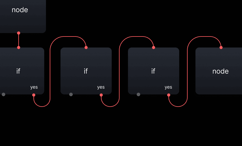
❌ Clients connected numerous "if" nodes horizontally within a vertical sequence, taking up considerable memory and space.
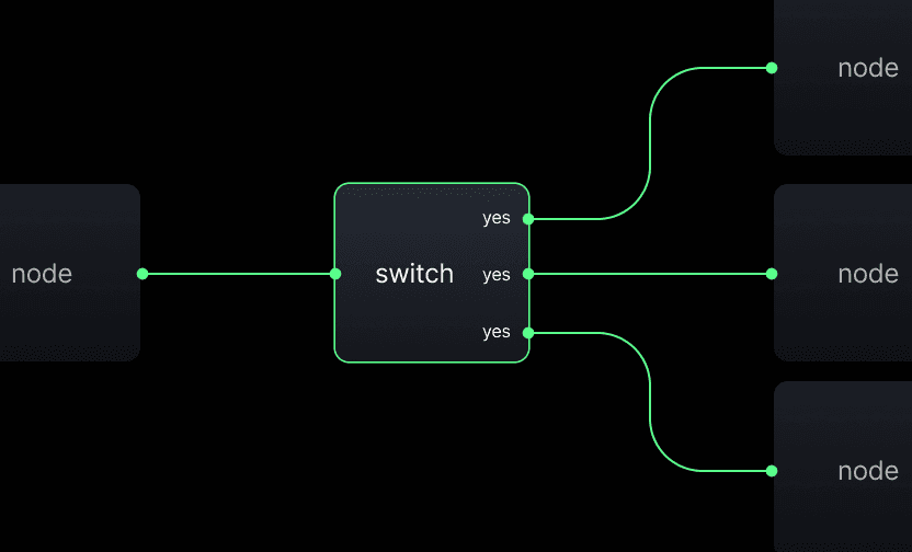
✅ A switch node can handle a long list of cases, and connect with other switch nodes. This saves memory and makes it easier to understand its flow.
Automations 3.0
Before designing I needed to assemble a team, and do research.
Organizing the project
I broke the project into three parts tracked in Linear—Canvas, Node, and Debugger—with each project having it's own set of issues (tickets). Although the Debugger was planned as a separate project, we made design choices that would make integrating it smoother down the line, ensuring we didn't design ourselves into a corner. We held weekly planning meetings, collaborated via Slack, and held quick huddles when needed, keeping everything on track for the cycle (sprint).
Team composition
The project required a team of senior resources to ensure a strong foundation was set and migration was not an issue. I consulted with our CTO on a weekly basis to ensure resources aligned and timeframes were met.
Me
Product Designer
UI, UX, PM
Maryam
Product Designer
UX
Brandon
Sr Engineer
Frontend
Drew
Staff Engineer
Backend. Architecture
User and data research
Automations 2.0
The positives ✅
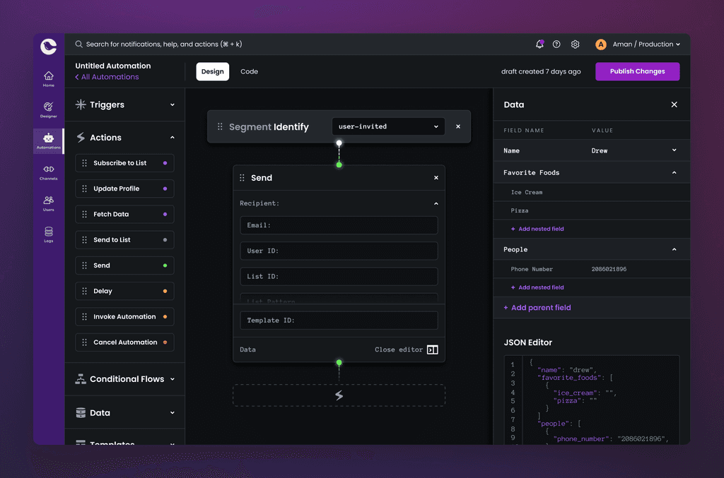
It was extremely powerful.
It feels smooth to drag nodes around.
"I like that we can override with JSON".
The negatives ❌
Hard to know where to focus.
"Everything is too big. I can't see my boxes (nodes)."
Unclear where to start. "Do I need a Trigger?"
No indication what node is selected.
Unclear why some information is on the nodes and others on the panel.
Afraid to publish.
No version history.
Hard to read purple on black.
The dashed animated connectors made it feel something was wrong.
"Why is this (automations) in dark mode? The rest of the app is white."
No way to identify where there is a problem.
"I don't know what others changes when I am not here."
4
Average Automations by workspace
Average amount of nodes on an Automation
Automations 3.0
Nodes, frames, it all had to be redesigned.
I started with the anatomy of a node
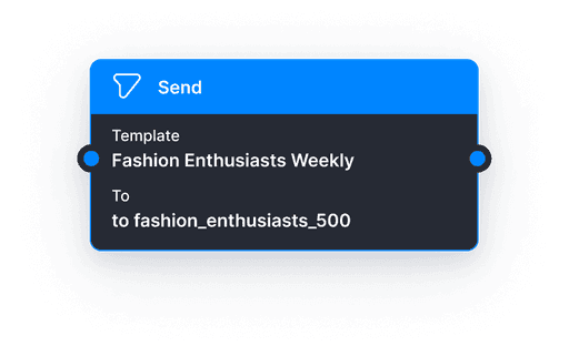
To declutter the canvas further and avoid confusion, I focused on minimizing each node and organizing ALL details in the right panel. Having it on both felt a bit crazy.
•
Human-readable: Nodes would now use a natural language to make the flow human-readable.
•
Dynamic text: Nodes would have dynamically changing text depending on what is configured.
•
State management: Nodes would have states for configured, non-configured, invalid.
•
Validation: Added validation to nodes. This would check for syntax and empty fields.
First attempt at a new node
To declutter the canvas further and avoid confusion, I focused on minimizing each node and organizing ALL details in the right panel. Having it on both felt a bit crazy.
The final node design
To declutter the canvas further and avoid confusion, I focused on minimizing each node and organizing ALL details in the right panel. Having it on both felt a bit crazy.
Node foundation
Empty state
Configured node w dynamic text
Selected node
Invalid node
Used the foundation for the switch node
The whole reason we are doing this can now follow the new established patterns. It will grow vertically depending on how many cases are added to the switch. This introduces more power to our users. They can use 'if' nodes alongside 'switch' nodes while having more 'accurate' structure to their flow.
It's also visually unique, making it easier to identify at-a-glance without breaking patterns.
Switch node!!
Simplified the interface
To improve usability and create a cohesive look with the rest of Courier’s platform, I started by clearing out the visual clutter and focusing on simplicity. It also would follow our Heron Design System patterns.
Removed the left panel
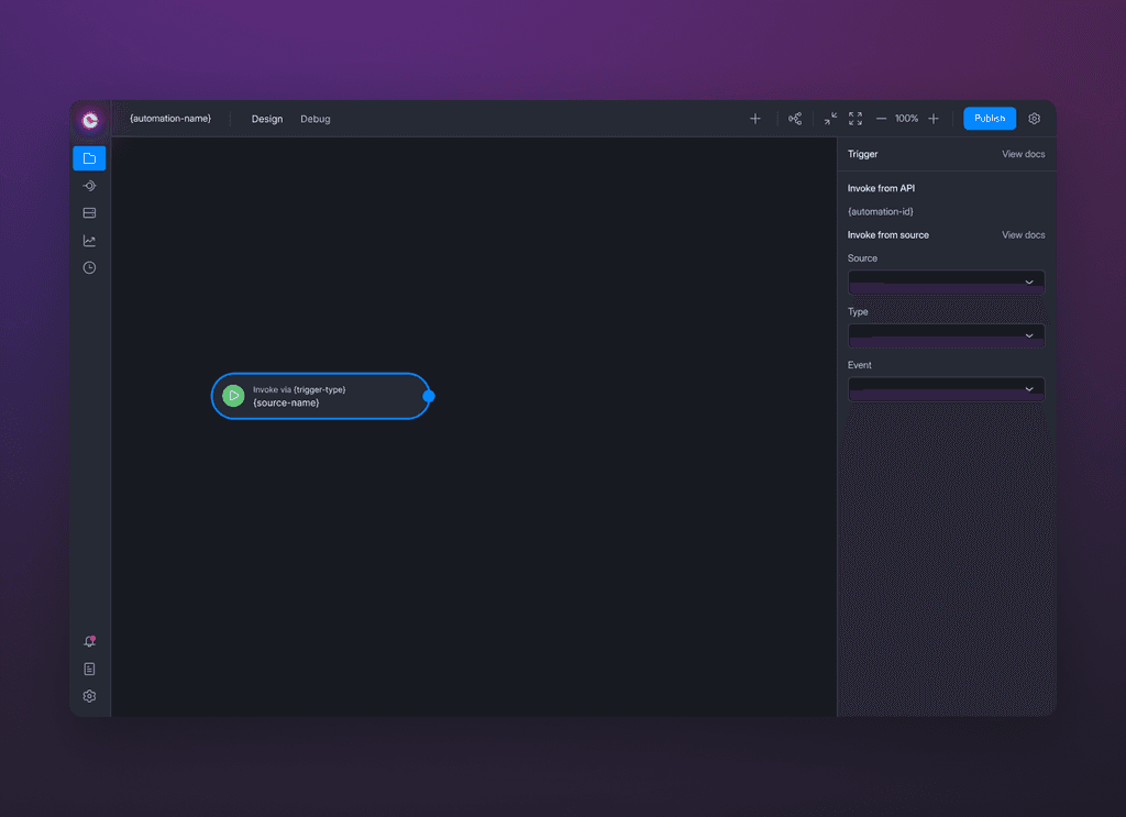
Eliminated the drag-and-drop panel, allowing users to right-click to add nodes., or pressing + at the top. This helped bring the focus to the flow.
A fixed trigger node
Created a fixed trigger node on the canvas to serve as a starting point, making it immediately clear how to begin. It cannot be deleted.
Canvas controls
Enabled zoom features and shortcuts accessible from the top bar. We also added buttons to auto-arrange your nodes.
Version history
QOL improvements
Autosave: Every change is saved automatically, giving users peace of mind while they work.
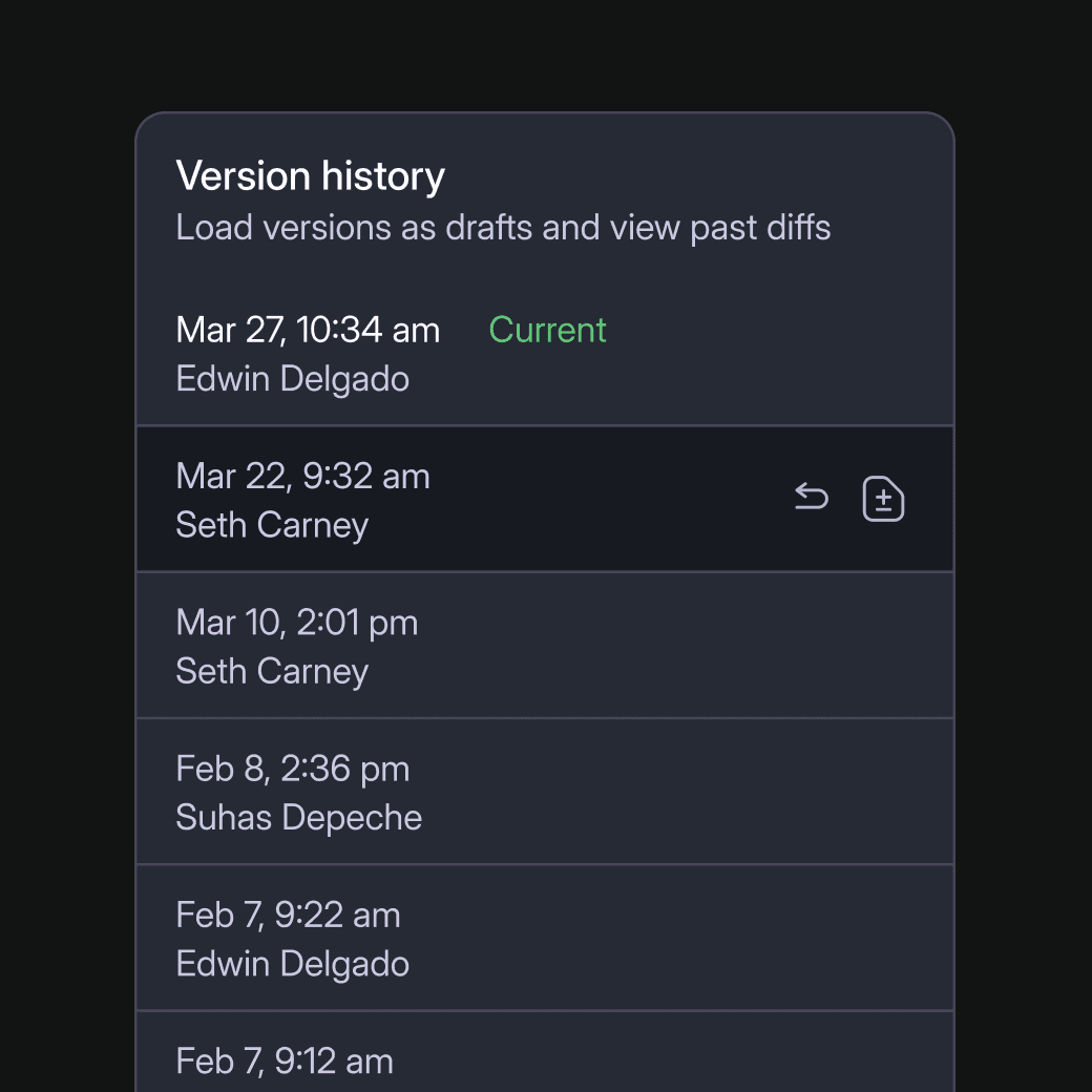
Version History and Draft Mode: Created a versioning system where each publish event is saved as a new version. Users can pull any version into a draft, allowing them to explore changes without risking live workflows.
Diffs: Users can now view data before and after publishing in a standard diff.
View automation diff
Automations 3.0
A huge success!
Results
We had no downtime, made it opt-in at first, and we're slowing rolling out the final migration. Since the update our issues have gone down. This freed up resources to work on new features like our new Debugger for Automations tool.
-95% CS issues
UI bug related, and faq's.
+200% workspace creation
From 4 to 12 average automations
+ 350% invokes per sec
From 4 to 18

