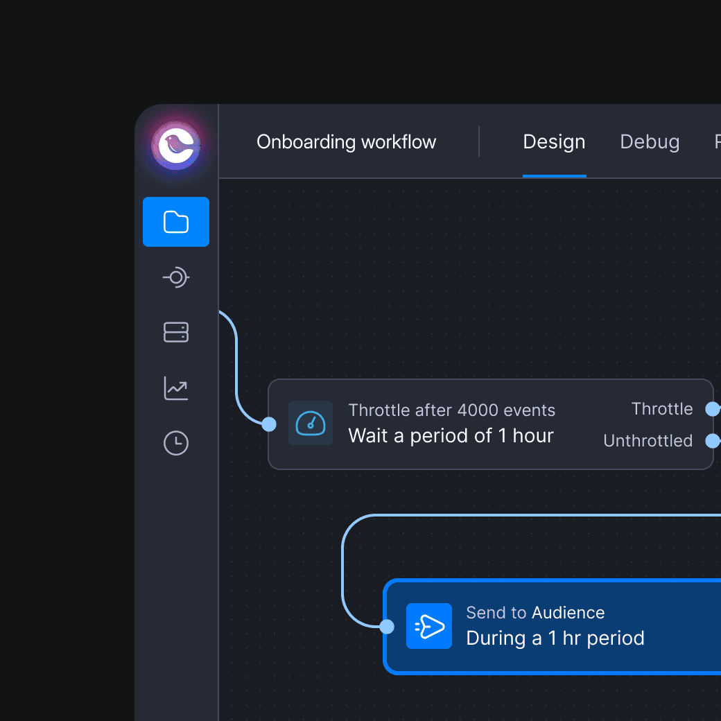
Courier Redesign / Rebuild
What is Courier?
Courier is a platform designed to help businesses manage and deliver notifications across multiple channels—like email, SMS, push, and chat—all from one unified place. Customers can create customized message templates, control routing logic, and analyze engagement through powerful insights.
Why a massive redesign / rebuild?
I am the Co-founder, but after 2 years I decided to move toward bigger companies. The CEO told me that after I had left, they hadn’t maintained a clear vision or structured design approach. All feature requests came from Sales, aiming to attract customers—but it didn't work. The app had become slow and inconsistent, with Customer Support flooded by complaints about performance and bugs. I decided to come back to help.
"Courier was losing customers because of performance, outdated designs, and bugs."
Together, the CEO and I agreed that Courier needed a full redesign and rebuild to survive. This was not a light decision, and we looked at other options first. A cost analysis told us it would take less time to redesign and rebuild then fix what we had. This would mean all teams stepping up, aligning the roadmap, and forming a dedicated team I would manage to drive this effort.
Redesign
Before designing I needed to get the company aligned, create a team, and do research.
Team composition
While all teams would play a role and collaborate with us, we still needed a dedicated team to work on this full-time. We met daily in the beginning, and then switched to weekly as the project moved forward and we all knew what we were doing.
Me
Principal Product Designer
UI, UX, PM
Maryam
Product Designer
UX
Troy
CEO
Consultant
Brandon
Sr Engineer
Frontend
Riley
Sr Engineer
Frontend
Redesign
Keeping track of progress
A simple clasification and language for the whole company
Project managment
I began by cleaning out Linear, which had accumulated around 1,500 issues, most of them outdated or irrelevant. I reduced this to fewer than 400 active issues, cutting dead projects—over 40 in total—including those tied to people no longer at the company. I gave the team a week to tag any active projects with notes; anything without a note by the end of the week was deleted. This streamlined the backlog to just four or five main initiatives, each containing relevant projects, making it easier for the team to focus.
I also held an all-hands meeting to introduce the initiative, align the company, and share how we’d need their input and collaboration. This was a important in building a sense of shared purpose across the company, especially since, at the time, the company hadn’t yet established common goals.
The 3 card system
How did I decide what tag to use?
We could view our progress through a feature-flagged dark mode
All components in the new DS (Design System) would use tokens and would support light and dark mode. An internal feature flag allowed us to see what UI elements were hardcoded, and which ones used the new DS.
Research
Customer support: Spent time with them to give me their top problems.
Personal: Looked at the industry, standard practices, old references of concepts I had done.
Data analyst: Spend time with our DA and created a plan to start queuing metrics we found useful. Identified power users for reference.
Investor conversations: Pat Malatack, former VP of Product of Twilio gave a ton of feedback of what was broken.
Team conversations: Spoke to every team to get a feel of what was not working for them.
Dogfooding: Went though onboarding and set up my environment and used the product.
Shocking research findings
Ok so… there were a lot.
Some screenshots showing massive inconsistency
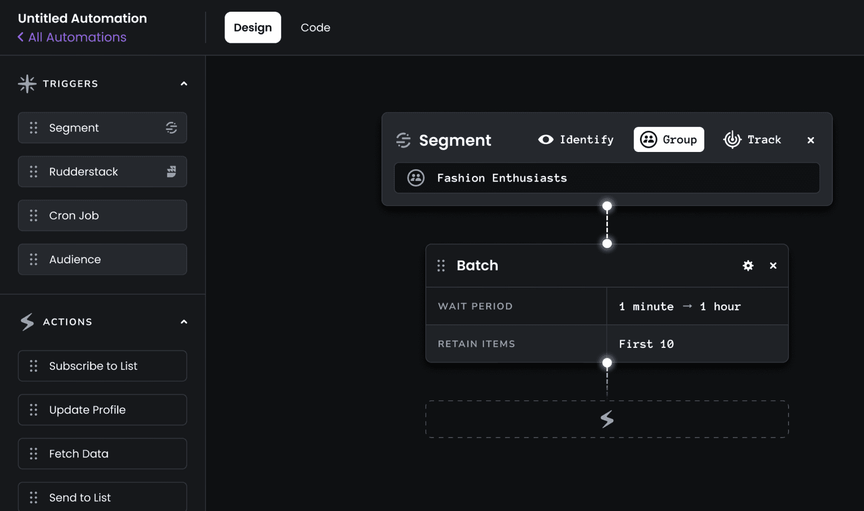
The app was only available in light mode, by automations used a different style and was only available in dark mode. The reasoning was this was the way to introduce a dark mode into an app. Applying token to Automations went up the list of priority to at least make it feel part of the app.
Introducing
I designed a minimal DS that would fit our needs, and follow rules and guidelines.
Creating the design system in Figma
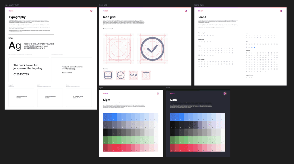
With the audit complete, I designed and built a custom design system in Figma, tailored specifically to Courier’s needs and ensuring that every component had a purpose, avoiding unnecessary bloat. We did not use an existing DS as they come prepackaged with too many elements. We were trying to consolidate as much as possible.
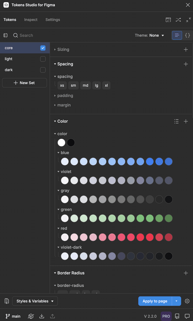
I did all the UI elements and worked with engineering to install Token Studio flow. This system established:
•
Token-based consistency: Managed core elements like color, spacing, font, and layout. Pretty standard.
•
Color and spacing tokens: I defined tokens for primary colors, background hues, text, and panel colors. Each color was referenced in both light and dark modes, where light mode referenced one palette, and dark mode referenced another—easily toggling between modes and allowing quick future customization.
•
Adaptive sizing: Set up a universal sizing structure (x-small, small, medium, large) with specific pixel values to create consistent padding, margin, and element spacing across the app.
•
Token Studio for direct updates: By integrating Token Studio in Figma, I enabled design-to-development collaboration without bottlenecks. This setup allowed me to push token changes directly to GitHub, where engineers could approve them, facilitating real-time design updates that saved critical time and resources.
I created standard foundational elements. Yup, I did all from scratch.
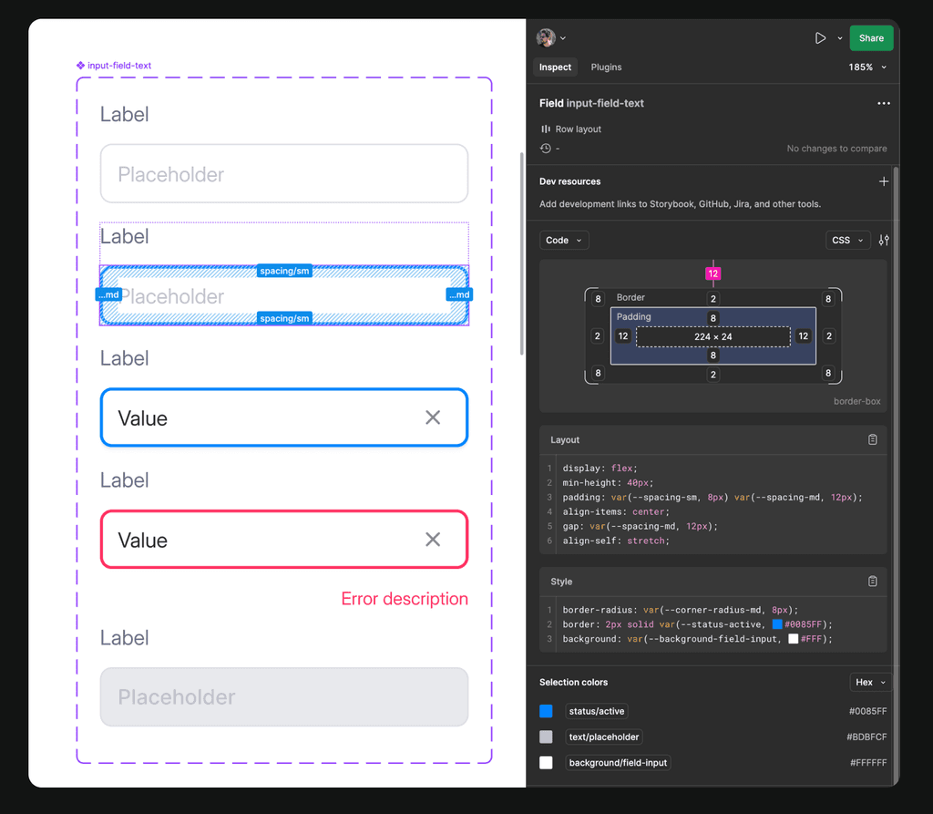
All elements were mapped to our token and design system in Storybook
Rollout
While I prefer milestone releases, this was too big to keep a separate code base. Literally rolled out day-by-day whenever anything was ready. Styling elements in the DS were still matching the old design (color and sizing) until we had enough done. Switching the style over to the new one when we were ready took a matter of minutes.
Some before / after shots
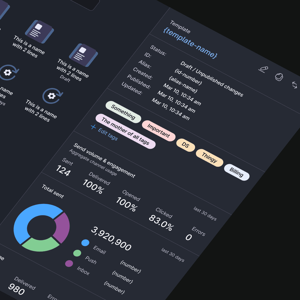
A small sample of the changes I did (some currently in flight). All designs shown were done by me.
Before
After
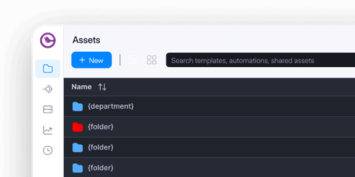
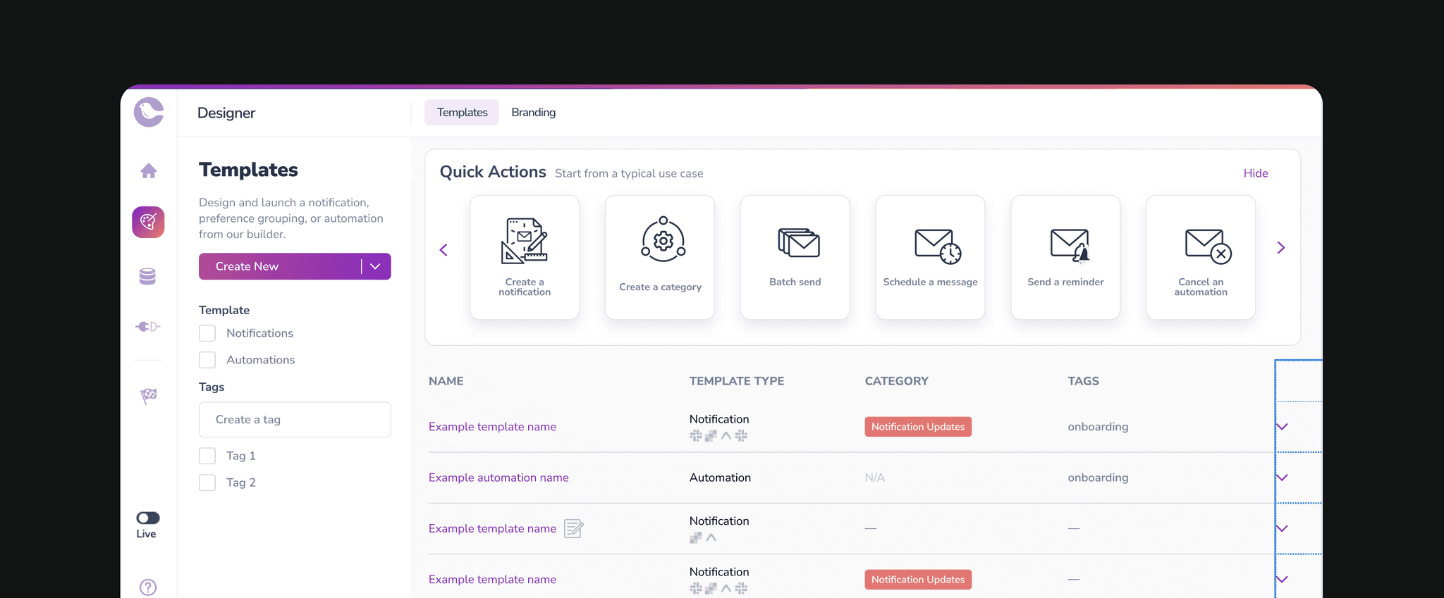
Asset Manager, formerly Template/Notifications
Automations 3.0
Redesign
We could see the effects and changes on a monthly basis.
Feedback
I took feedback as we released. But we were impressed to see that no customers complained. If anything, we got constant reminders that they were happy about the changes. The most common feedback was wanting to more developer friendly flows. This was an initiative I wanted to do after called Courier EF.
Results
The main praise we got was on performance. Every week we would get asked what we were doing to make the app faster. The reality is that by eliminating redundant components and optimizing DOM load, load times dropped from 9–10 seconds to under a second. A gain of 89.5%!! in loading times throughout the app (some sections need to ReBuilt to improve their performance).
-89% Load times
Huge gains
Twilio signed
Their confidence was earned
Engineers didn't not have to worry about styling
Minimal design handoff
All designs were attached to the DS and tokens.
Increased uptime
4 days improvement in yearly uptime
-80% CS
UI related customer support down
Winning 90% against our main competitor
Up from 60%


